Has film’s obsession with teal and orange gone too far?
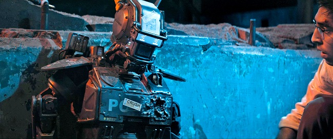
Chappie (2015) Sony Pictures.
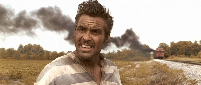
Ever since films switched from analogue to digital recording, the art of colour grading in post-production has allowed directors and colourists to affect the feel of their work by applying filters and altering tones. The Coen Brothers’ heavy use of sepia tones in their 2000 film O Brother, Where Art Thou? is widely referenced as one of the earliest examples.
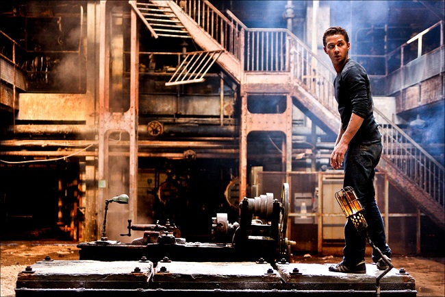
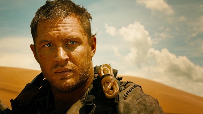
Since then, there’s been a steady rise in the number of films focusing on two particular colours - teal and orange. Mad Max. The Avengers. Almost every single Michael Bay film. Once you notice it for the first time, it’s impossible to forget.
O Brother, Where Art Thou? (2000).Momentum Pictures, Universal Studios
Transformers (2007).Universal Studios
This two-tone revolution has elicited heated debate from film experts and fans alike, but before diving into this we need to understand why these colours are used so much in the first place.
Why teal and orange works
The answer can be found in colour harmony. Orange and teal sit on opposite sides of the colour wheel, making them ‘complementary’ colours, and when placed together the contrast can make an image ‘pop’ and come alive.
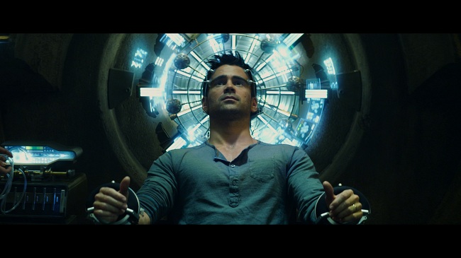
Grading can also be used to cleverly draw focus to the important aspects of a film. In this instance, the orange helps to accentuate human skin tones or the explosions in an action film, while teal is usually applied to shadows and backgrounds, providing contrast for the rest of the shot.
Total Recall (2012). Carolco Pictures, TriStar Pictures
Aside from these visual benefits, directors might choose to use this colour grade for conceptual reasons. In an article on the same subject, TV Tropes writes: “...fiery orange and cool blue are strongly associated with opposing concepts — fire and ice, earth and sky, land and sea, day and night, invested humanism vs. elegant indifference, good old fashioned explosions vs. futuristic science stuff.”
Why it doesn’t work
But there are just as many people who disagree with this trend entirely. Some see it as nothing more than a form of visual hyperbole - an over exaggeration of colour and contrast in an attempt to make everything look as vivid as possible. The website Film Junk writes: “If you’re in the group that believes major studios have run out of ideas for scripts, you can now join in to the group that believes they’ve run out of ideas for color too.”
The consequence of this dogged persistence to paint everything teal and orange is that this has become the typical film ‘look’ now. Almost everything coming out of Hollywood is graded identically, and this bandwagon mentality may lead directors and colourists to become lazy in their attempts to keep their audience interested.
Mad Max: Fury Road (2015).Warner Bros. Pictures
Others just simply find it pointless. Films have always naturally gravitated towards the use of complementary colours, so what is the value in further colour grading? The phrase “if it ain’t broke, don’t fix it” has never been more pertinent.
You’ve heard other people’s opinions, but what do you think? Are you mesmerised by teal and orange, or has it put you off going to the cinema for good? Let us know in the comments below.
