Capturing the best of both worlds
The effect that different colours can have on our photography has never been more discernible than today. Each and every shade can be toyed with in Photoshop, while apps such as Instagram and Hipstamatic have popularised the use of photo filters that range from the subtle to the ‘accidentally-been-through-the-washing-machine’ look. Hours can be spent tinkering with brightness and contrast settings in search of the perfect hue, yet photographers are still choosing to forego colour altogether and opt for black-and-white. In this day and age, the real question is: why?
Well, in short, colour and black-and-white can highlight completely different elements of the same photo. Professional photographers will not simply choose one or the other at random - they look at what they're about to shoot, think about what should be the main focal points and decide accordingly.
Black-and-white is most widely used for its timeless feel. A photo taken today could look almost exactly the same as a photo taken ten years ago, and it can help to draw a veil over the season or the time of year that it was taken. Take the shot below as an example. The colour version shows off the blue sky and lush, bright colours that are synonymous with a summer’s day. Now look at the black-and-white version. Suddenly it’s much harder to put a finger on whether it was taken during summer or winter.
It’s also extremely useful when a photo has clashing colours that could distract the viewer from the the real story. This is why wedding photographers are such advocates of black-and-white: it allows you to focus solely on the emotional state of the couple.
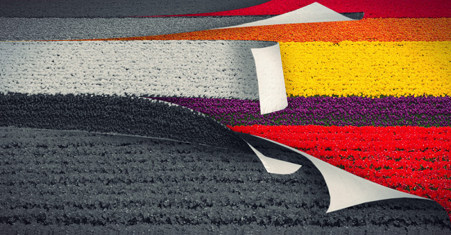
While black-and-white can simplify the visual story and place focus on form, light and shadow, colour can provide an important extra layer to that story. Take the below picture of a tulip field, for example. You’re instantly drawn into it by each stripe of colour, and only then do you start to zoom in and focus on the shape and definition of each flower. Here, colour doesn’t just contribute to the photo, colour is the photo.
Colours also allow the viewer to connect with the photo on a more subconscious level. A lot of red and orange might reflect a feeling of passion or anger, while a soft blue can indicate peace and calm.
Ultimately, there’s no right or wrong when deciding between shooting in colour and black-and-white, but both choices have the power to completely change the mood and atmosphere of a photo. Opting for bright bursts of colour may catch the eye in an instant, but the subtlety of monochrome has the ability to hit just as hard.


